Archive

Photography

SHIN NOGUCHI

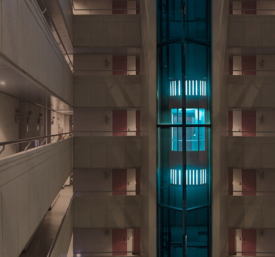
Shin Noguchi is an award winning street photographer based in Kamakura and Tokyo, Japan. He describes his street photography as an attempt to capture extraordinary moments of excitement, beauty and humanism, among the flow of everyday life and has a discreet, poetic and enigmatic approach that is sensitive to the subtleties and complexities of Japanese culture without using posed/staged and no-finder/hip shot. “Street photography always projects the “truth”. The “truth” that I talk about isn’t necessarily that I can see, but they also exist in society, in street, in people’s life. and I always try to capture this reality beyond my own values and viewpoint/perspective.” Today we take a look at Shin’s series titled Nonverbal Space.

shin_noguchi_01shin_noguchi_02shin_noguchi_03

“Nonverbal Space”, it is unstable, distorted, and contradicts what we have created. And [Ma], exists in there.

The characteristic of the Japanese [Ma] is very beautiful, also delicate, and if you are not always aware of the very small amount of undulation of [Ma], it loses balance immediately.

I tried to listen to a lump of invisible voice (or the voice that was confined) of [Ma] existing in nonverbal/unstable spaces of our daily lives, and I aimed to visualize the two invisible elements, [Ma] and human [Gou] (karma/conduct) that underlies in [Ma].

Also, in this project, I dared to express the human being as the existence (visualization of [Gou]), not as an individual but by making the whole nonverbal space the subject without including people in the frame. this way, i am managing the awareness of the relationship between individuals, society and the surrounding environment for the viewers.

shin_noguchi_04

shin_noguchi_05shin_noguchi_06

Danshi Tatekawa said that “Rakugo is an affirmation of human [Gou] (karma/conduct), that is, inconsistency”, and Alexander Pope also said that “To err is human, to forgive divine”.
As they talked towards “people”, could their words really be said in front of the “Nonverbal Space” which is more closer to the “society”? and could that “forgiveness” recreate another type of hope or a new possibility in this land where everything had changed to something that looks irreversible?

I shoot the “Nonverbal Space” (it is unstable, distorted, and something contradicts what we have created) while being aware of their words which were created by human beings as well.

Finally, by expressing the subjective viewpoint of the photographer, this project is, so to speak, an antithesis against the new topographic photographs.

shin_noguchi_07shin_noguchi_08shin_noguchi_09shin_noguchi_10shin_noguchi_11shin_noguchi_12shin_noguchi_13shin_noguchi_14shin_noguchi_15

To view more of Shin’s work please visit his website.

08-1

Seoul-based Korean artist Seokmin Ko’s photographic series The Square evokes both a peaceful sense of being at one with the world around us and a feeling of being lost. Addressing ideas of normalcy and identity, the artist holds up a giant mirror to reflect his surroundings and camouflage himself from the viewer. “We live locked by each other’s view and even our eye views sometimes serve as surveillance over each other. When individual views tamed by cultures and customs in societies aggregate and then serve for views of groups, each individual has no choice but stays as a standardized human being hiding himself or herself. Like this, under society strongly influenced by views of group, a real individual can’t co-exist… We begin to change ourselves to become ‘A normal human being.'” (via)

07 07-1 06 06-1 05 05-1 04-1 03-1 01 02-1 02 03

Vittorio Ciccarelli

With the taste of summer around the corner here in the UK, blue skies teasing to what the summer could bring.  Having personally not had a summer in 15 years these photos by Vittorio Ciccarelli suggest the warmth that a summer brings.  They tempt whilst also remind me of the endless heat that also accompanies these long summer days, maybe less so here in the UK.  Click here to see his website

Vittorio Ciccarelli (1)

Vittorio Ciccarelli (6)

Vittorio Ciccarelli (9)

Vittorio Ciccarelli (3)

Vittorio Ciccarelli (4)

Vittorio Ciccarelli (10)

Vittorio Ciccarelli (7)

Vittorio Ciccarelli (11)

Vittorio Ciccarelli (12)

Vittorio Ciccarelli (5)

vittorio-ciccarelli 14

Vittorio Ciccarelli (8)

Screen Shot 2014-11-02 at 14.44.48

The work by Karyn Olivier is playful yet unsettling at the same time.  The attraction to object or site, altered with an acute sense of humour or timing.  The ease of her works to create thoughts with from their first impression is incredible.  Maybe its just me and the area of interest Olivier operates within is somehow on a similar wavelength as my own thoughts.  Yet I feel it is also a sign of an artist who is intone, adept at knowing balance, able to strip a work back and not to make something look like its trying but instead for the work to operate on its own.  I am interested to see future projects that stem from Oliviers’ practice.  Click here to see more work on her webiste.

kazemzadeh.olivier.seesaw

Screen shot 2011-09-23 at 19.33.20

slavery-and-hot-sauce-detail-1024x682

10734161_10154635671980018_6272476073921151849_n

What is a starting point or how do I find an IN?  A week ago I arrived in Yerevan, Armenia and within this week I have to find my bearings as well as figure where to begin.  Though I have current and ongoing themes within my work I change, my location changes and especially the landscape I experience.

10447878_10154639022390018_2504366940359114846_n

Firstly my process is simple I go get lost.. Not in the moment per se but in a place.  Public transport is easy to do this in a new country.  Just get on and do not worry about the direction just travel.  This here in Yerevan is perfect as the whole experience is totally different from other countries I have experienced.  The majority of the transport system is run by small minibuses similar to Ford Transit vans.  I am 6’4″ so even getting into these at times is a challenge.  Especially in rush hour, oh yes just like elsewhere in the world the transport system still gets crowded and these minibuses are full.  Standing room only and you would be surprised at how many people these buses can carry.  Its an impressive feet in itself.  However the whole process is calm and collected considering the horns being used by other road users and taxis.  The public just get on with it without any complaint or quibble.

10626730_10154639023870018_3404183554792679757_n

Anyways back to process.  My approach is I guess similar to the Situationists – Guy Debords’ dérive.  I use my one and one approach with the city to experience the infrastructure and witness the makeup of the city.  I am not directed as to where I head and would rather each left and right decided when it is met.  By passing through districts, suburbs and communities you can get a feel for what atmosphere and people live in a space.  This interaction with the landscape creates a dialogue that builds the more I walk and the further days spent doing so.  I start to question or be drawn into errors, repetition, oddities, familiarities and characteristics.  Its certainly not just the physical or visible that appeals, though sometime its the sense of smell or piercing sound that leaves a lasting impression.  I find my experience of space similar to how I read people and their personalities.  The anthropomorphic nature is something allows me to form initial ideas.  What are these ideas, well I have no idea until I start to delve into these dérives.  How do I know when I am onto a idea or something that is worth investigating further I do not know at first.  However I could compare it to tennis.  If you think about tennis and the shots that win matches or serves that are aces.  These are not ideas that appeal to me as they are either one of, one liners or too literal in their representation of an idea.  The ideas that I am interested in I would compare to the rallies that build and sometimes keep on going.  These rallies I would compare to the discourse that the ideas created within my own research and investigations and those that I speak to regarding the work.

Mirror Image

So by using this kind of dérive or active losing oneself I create an instability that aided by the new location or country sparks my engagement.  I move and navigate the new spaces without plans though attentive to that which is around me.  Over time my mind starts to read that which is around me in new ways and dialogues start to happen and it is these that I use to form the basis for new work/projects.

10557272_10154639021845018_9114229316461495729_n      1010128_10154639030665018_6517759871085223924_n

I am not one to normally care or even look at who has been nominated or won certain prizes.  To be honest I am not sure how I ended up looking at the shortlist for this years New Sensations.  However I am glad I did as there are some works that really interested me.  Here is the link to the 25 artists who have been shortlisted.  I have posted a few photos of those that I liked their process or output.

Click here: New Sensations 25

Sarah Roberts

1426689-71365982-7

Roderick Laperdrix

1360795-7

1361639-7

Felicity Hammond

1351285-7

1358457-7

Collette Egan

1359805-71359635-7 1359752-7

logonew

On the 1st of October I will be heading to Yerevan, Armenia for two months to partake in an art residency program operated by Art and Cultural Studies Laboratory.  This is an exciting opportunity especially after my experience in Athens previously I feel more than ready to make the most of my time there.  It is a place that I have not experienced before but sits in an important part of the world.  Its rich history and current economic state will provide many new thoughts and ways to reflective current thoughts and perceptions.

This year has seen me move quite a bit and most of that time I have been immersed in countries where I speak little of the language.  This isolation in my nomadic practice really plays on my current thoughts of what home means to me.  My projects tend to start from a personal response but then tend to be expanded to become works that others can reflect on and read in their own light.  However I feel also whilst in Armenia I need to document the daily emotional attachment I have to what I deem as home, the never studio or practice nomadic..

I am also grateful for the funding that has been provided for this time I will spend in Armenia.  The ECF Labs and their Step Beyond Bursary has made this time one which I can devoted solely to furthering my research and creating new works.

60_years_formatsRGB_ECF_blacktext_60_combi

1086987


Dazed and Confused magazine has just posted an interesting article about Scottish artist Robert Montgomery.  However it was this work about “All Palaces Are Temporary Palaces” that resonated with me.  The idea that one builds a palace, a castle or even a house with a vision.  That vision or idea changes with time so hence this once dream place or palace is only a temporary palace or utopia.  We can constantly dream utopias but once we stop and build and consider these, even fabricating them in the real.  We really only build a past utopia something that was once.  

Full article here:

Robert Montgomery Website here:

backstrom

Re:post from Hyperallergic, written by Thomas Micchelli on August 16, 2014

The exhibition takes its title from a poem by Susan Howe, and its subject is aphasia, described in the gallery’s press release as “a cognitive disorder causing an inability to understand or produce speech.” The curatorial intention, drawing on concepts developed by the Russian-American linguist and scholar Roman Jakobson, is to present aphasia “as a cypher with metaphoric and metonymic implications.”

An intriguing concept: how to create an art exhibition about the inability to communicate? That is what curator Rachel Valinsky has set out to do in Itself Not So, the current group show at Lisa Cooley on the Lower East Side, and for the most part, her selections neatly vault past the inherent paradox of the proposition.

Typically (though not necessarily) caused by a stroke, aphasia ranges in severity from an inability to find the correct words for things to the complete loss of the capacity to use or comprehend language, whether spoken, written or signed. At the same time, it does not interfere with the patient’s mental faculties, which only increases the frustration of those suffering from the disorder.

dean

The exhibition, according to the gallery statement, has assembled a selection of artworks that “taken together, form a polyphonic response to the fundamental rupture between thought and expression that aphasia engenders.”

The metaphoric implications of aphasia’s “fundamental rupture between thought and expression” can be readily applied to the creative process, where the rupture between subject and form, idea and object, can often feel unbridgeable — and yet the connection must be made if the artwork is to hold together. And so how does one develop such a concept in the context of an exhibition? The curator’s answer is evidently to present works in which deliberate omissions and obfuscations are major components, as if they are confronting us with their own unmaking.

This idea is at its most conspicuous in a work like Michael Dean’s “Analogue Series (tongue) On the pronunciation of the letter L” (2014), which features a straight-back chair with a black (aphasic?) tongue in the place of one of its four legs, rendering it unusable. In a piece by Ryan Gander, which bears the impossibly long title, “Associative Template # 23 – (And all that chatter around your career) *Debit and Credit by Dan Fox, first published in Frieze, Issue 119, Nov-Dec 2008” (2009), aphasia’s gaps in comprehension are suggested by the holes left in a large, handprinted photograph from which sizable sections have been laser-cut and placed on the floor beneath it.

gander

The sensation of halting, unclear thoughts is visualized to striking effect in Fia Backström’s “An-alpha/pet-isms…” (2014), an installation consisting of sheets of clear vinyl film hanging from five standing steel frames, upon which letters of the alphabet float like obscured, distorted ghosts amid inky clouds, blurs and blots.

And there is “I Hate” (2007), a hi-def video by Imogen Stidworthy that focuses on a middle-aged man, presumably afflicted with aphasia, and his attempts to try and speak. All of these works walk the tightrope between clarity and unintelligibility in ways that are by turns visceral, heady, sensuous and whimsical.

The reason behind including some of the other works in the show is not as clear-cut, but that makes them no less engaging. There’s artist/musician Ben Vida’s “Slipping Control (pink/green/blue)” (2013-2014), an elegantly designed triptych comprised of three framed digital prints employing patterns of letters laid out in the spaces between pink, green and blue rectangles. The work is the basis for a vocal piece performed by the artist, whose repetitive, percussive soundings could be likened to aphasic stammering, but without the loss of control experienced by the patient.

vida


Rick Myers’s “Either side of the eye” (2010) offers two steel squares covered in lubricating flake graphite, one featuring a concave depression and the other with a matching convex protrusion. A quick glance can fool the eye as to which is which, but such visual ambiguity doesn’t seem to touch on the communicational handicaps stemming from the disorder.

Another work by Myers, “Study with BEFORE following AFTER” (2010), more successfully conveys the idea of expression held captive. The piece couldn’t be simpler — five black, vertical bands running the length of a narrow sheet of paper — but there is something compellingly dense, even layered about it. It is tempting to think that this impression is related to the work’s materials and process, which are described on the checklist as “Alcohol sealed sooted paper with etched soundwaves of the words AFTER, BEFORE, AFTER, having been spoken aloud and transcribed using a phonautograph.”

There are two other abstractions in the show, both by James Hoff, though they look like the work of two different artists. “Concept Virus #1” (2013), in enamel on aluminum, looks like hyper-pixelated video snow, while “Stuxnet No. 5” (2014), a red, white, blue and black Chromalux transfer on aluminum, is a Gerhard Richter-like smear of color. Neither seems to fit under the exhibition’s umbrella, which is also true of a conceptual piece by Julien Bismuth called “A train of thought” (2011), consisting of four sticks painted different colors on each of their four sides. In the notes for this work we are told, “The sticks are rotated daily so as to go through all 24 permutations of the four-color sequence.” Perhaps the piece’s daily evolution is meant to correspond with the slow, frustrating grind of rehabilitative therapy?

stidworthy


According to its wall text, another conceptual work, Research Services’ “If You’re Phone Doesn’t Ring, It’s Me” (2014), takes the subject of aphasia “as a social phenomenon triangulated by politics, aesthetics, and technology.” The artists, soliciting phone numbers from the viewing public, plan to interview participants via “robotic avatars” and broadcast the conversations in the gallery.

The exhibition’s remaining pieces, all text-based, perhaps have the most tenuous connection to aphasia, but they point in some interesting directions. Sophia Le Fraga’s video, “W8ING” (2014), consists of scrolling cellphone text messages chockablock with abbreviations and emoticons — which, in their disuse of language, may or may not be signs of aphasia. “W8ING” is supposedly a riff on Samuel Beckett’s Waiting for Godot, at least according to Karen Rosenberg’s review in yesterday’s New York Times, but the triteness of the dialogue makes the connection murky at best. (Le Fraga’s other video, “TH3 B4LD 5OPRANO; or, English Made Easy,” 2014, apparently applies the same treatment to Eugène Ionesco, but the piece was not available the afternoon I visited the gallery.)

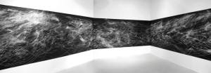
Both Sue Tompkins and Christopher Knowles use typewriters to create their works. Tompkins’ handsome, 18-part “The Lost Weekend” (2014) runs in a horizontal line across two sides of a corner of the room. Incorporating typewritten designs and enigmatic phrases on letter-size sheets of newsprint, the piece’s mystery-shrouded words could be considered stand-ins for the confusion over precise meanings that aphasia can cause.

saroyan


Knowles, who received a diagnosis of autism when he was a child and came into prominence at the age of 17 when his poetry was included in the libretto for Philip Glass’s Einstein on the Beach(1976), has contributed two of his pattern-based, black-and-red typewriter pieces, “Designs” and “Butterfly Blocks,” both from the 1980s. At the top of “Designs,” he has repeated the words “black” and “red” in their corresponding colors. The self-evident meaning of those marks, which soon give way to complex streams and patterns of a single letter — the lowercase “c” — embodies a poignant literalism in search of human connection. There is no abstraction, no chance of a mistake: red is red and black is black, a simple truth that marks the first step in the stairwell toward a sense of surety and understanding.

The poets Susan Howe and Aram Saroyan employ their own poetry as works of art in very different, very potent ways. Howe uses another obsolete technology, letterpress, to create drifting, squeezed and fragmented shapes out of excerpts from her poems; we don’t know what to respond to first, the elegance of the designs or the music of the words (some of which are illegible). But this is an instance of neither/nor — the physical beauty of the objects creates a doubled meaning, with each element dependent upon and inseparable from the other.

Aram Saroyan, a pioneer of Minimalist poetry, is showing “Lighght” (1989), the yellow-on-white silkscreen he made from his famous (or, for some, notorious) one-word poem, “lighght,” which was first published in 1965. Like the orders of significance in the pieces by Knowles and Howe, the image in Saroyan’s print is suspended between, and compounded by, what constitutes a word and the indefinable visual resonances carried by its semiotic representation. These poets, rather than falling into the rupture between thought and expression, bring to their visual works an understanding of the limits of language and the tools — from the metrical to the symbolic to the typographic — needed to traverse them. To make art out of their poems is just another step along the continuum.

Itself Not So continues at Lisa Cooley (107 Norfolk Street, Lower East Side, Manhattan) through August 29.

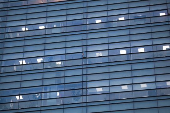
architecture-of-density-michael-wolf-01-630x420 architecture-of-density-michael-wolf-02-630x420 architecture-of-density-michael-wolf-03-630x420 architecture-of-density-michael-wolf-04-630x420 architecture-of-density-michael-wolf-05-630x420 architecture-of-density-michael-wolf-06-630x420 architecture-of-density-michael-wolf-07-630x420


Re-post from Highsnobiety

  • By Fritz Radtke

For about 20 years German photographer Michael Wolf has been living in Hong Kong – a city as beautiful and exciting as it is crowded. Being one of the most densely populated areas in the world, with an overall density of some 6,300 people per square kilometer, Hong Kong’s architecture is accordingly dominated by staggering highrise buildings. For his recent photo series ‘Architecture of Density’ Wolf has captured the city’s unique landscape. By removing skies and horizons, thus focusing on and highlighting the structures’ abstract elements, his photographs evoke a sense of endlessness – an ever-growing urban space.

Michael Wolf Website